At the start of the year, our team was readying for our largest revamp since launching Square for Restaurants in 2018. We had a lot more capabilities to show, plenty of learnings to build on, and a desire to revisit our creative and make it resonate more with our audience. Perhaps most importantly, we wanted to reposition Square for Restaurants as the entire ecosystem it has become and leave behind the outdated idea that we’re “just” a point of sale.
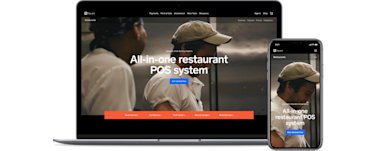
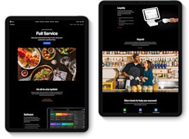
As part of this new ecosystem approach, we rethought our whole public web experience. To reinforce our broad seller base, we created tailored webpages for quick-service, full-service, fast casual, bars and lounges, and multi-concept restaurants. In the past, we would send out announcement emails when a new feature launched, but then we had nowhere to aggregate those features more permanently. We created a features section on our website that provides quick walk-through videos meant to explain functionality. We also highlighted additional products that restaurants need (and that Square offers!), such as payroll, marketing, loyalty, and team management, to convey all there is to gain from using Square.
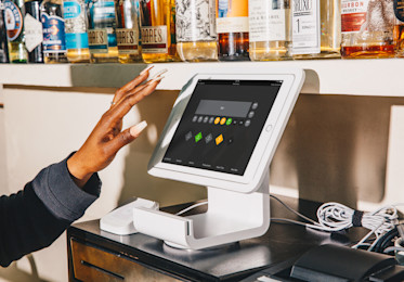
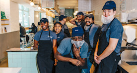
To showcase the restaurant environment first and foremost (and our hardware second), we introduced more imagery and updated our photography. New York–based Cole Saladino shot photos for us in his colorful style, which aligns more with food editorial publications than typical marketing materials.
Happy staff at Junzi in NYC, shot by Cole Saladino
We selected bolder typography to match Saladino’s vibrancy, and, in tandem, we amped up our use of red throughout the Square for Restaurants branding. Red paired with a secondary color, blue, creates contrast with our call-to-action buttons and feels fittingly bold for the restaurant world.
At Wayla in NYC, shot by Cole Saladino
The revamp was a collaborative effort with core team members representing design, product, copywriting, strategy, engineering, and marketing in San Francisco, Milwaukee, and New York, as well as our international restaurant teams in the UK and Australia. We were all working away — and then the pandemic happened.
We realized we had to pivot in order to support our sellers as much as possible. In fact, the entire company pivoted to support businesses by speeding up development and quickly putting out timely solutions like a free Square Online Store for restaurant curbside pickup orders, soon followed by on-demand delivery. To further help with discoverability, we created a directory of Square businesses that offer order pickup and delivery — and also eGift cards — through Give & Get Local.
At Junzi in NYC, shot by Cole Saladino
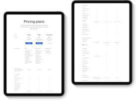
In the midst of this uncertain environment, Square for Restaurants launched a free plan that gives restaurants an accessible option. Once sellers are in the free plan, we highlight educational information, through onboarding emails and on our website, meant to demonstrate the value of our paid features. We simplified the research and shopping experience for Restaurants, moving away from abstraction imagery to more clearly show feature and pricing charts. Sellers can opt in for a free trial of our paid tier and choose to stick with it or drop back into the free plan. The creation of a free plan came at exactly the right time for the industry, and we’ve been amazed by all the creative and savvy ways businesses are putting it to use.
Clear pricing plans, features, and add-ons comparison
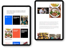
While much of the focus leading up to our launch was on the tactical side of the Restaurants revamp — color, graphics, lines of copy for the website, the size of buttons, how to market the free plan, etc. — we also designed and built an editorial hub for restaurant-focused content, called Square Voices. As time goes on, we will continue to aggregate resources and produce original content that speaks to the most pressing issues, trends, and topics in the restaurant world and among our community of restaurant sellers.
Square Voices, an editorial hub for restaurant-focused content
Now that all of this new work is out in the world, we feel proud of how it came together and can’t wait to test, improve, and iterate even more in the future. Our hope is that Square for Restaurants can always be as creative, relevant, and bold as the restaurants we serve.
