Motion breathes life into any story. In mid 2020, Square began an internal brand audit to evaluate what was working and where we had room for improvement. Looking at Square from the outside, we discovered that we didn’t have a clear point of view on how motion lives within the brand. There were some attempts to incorporate it into our visual language, but we lacked a strategic set of foundational principles and a shared understanding of why we needed to use motion at all.
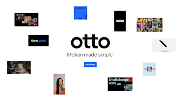
Every product has its origin story. Realizing our need for motion and the fact that not everybody knows how to use After Effects, we asked ourselves, “What if we built our own motion tool?”

It all started with our philosophy on motion and how it relates to the Square brand. In partnership with New York-based branding agency Athletics, we defined and published a core set of four motion principles to set the foundation for motion design moving forward.

At a high level, the technical aspects of our motion principles are based on hard cuts and smooth transitions. We use offset motion and shared momentum to help carry the narrative through. Once we established our motion principles for Square, we set our goals for the motion tool itself. What should it look like? How would people use it? How could we scale it for all skill levels? What about accessibility? Creating a user experience that allowed for rapid motion prototyping for all Square creative teams and beyond was no easy task. Teamwork was key to bring our technical and design disciplines together.
Function at the core
Under the hood, Otto has some pretty strong functionality. From a technical standpoint, we made sure to work with Athletics on a modular, scalable framework. This allows the tool to continue to evolve post-delivery so engineers at Square can modify, maintain, and extend the tool for future use cases. The partnership with Athletics also allowed us to have in-depth code reviews to guarantee a safe, secure, successful system.
But the biggest technical win for us is the ability to save motion files as JSONs. This gives everyone the ability to save and share editable motion files and easily make tweaks to projects without having to work with an editor or in After Effects. Having these working files on a local system will make the process more seamless than ever before — which is even more important as we continue our distributed working model with teams all over the globe.
Testing and prototyping
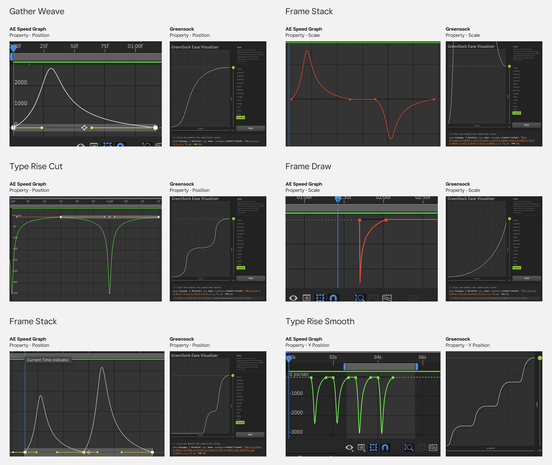
Once the full product requirements became clear, we hit the ground running with an alpha prototype to test capabilities at an early stage. Because we have 25 unique motion sequences, we knew we eventually had to stress-test them all to understand the unique complexities and how to make each one as easy to use as possible within this self-serve tool.
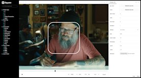
The alpha prototype proved what’s technically possible for Otto. We found ways for Otto to increase speed to market for creative projects by making our motion principles and techniques readily accessible and scalable. This cemented our POV that Otto would become an important link between all of brand, product, and marketing, breaking down silos that often happen in large design orgs. Not only does this cross-team cohesion help us work smarter, it also helps us flex our brand out in the world — showcasing our design system in clear, confident ways to attract new Square sellers, new ways of thinking, and even new talent within the company.
Otto takes shape
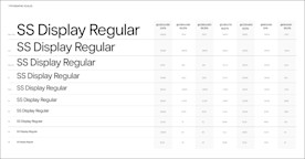
As we started our design process, we did all the necessary things we love to dive into as systems designers. We built a responsive 12-column grid, flexible canvas sizes, and typographic scales using a major-thirds framework.
Intuitive, cohesive design
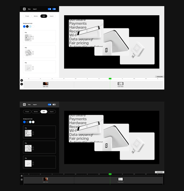
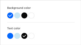
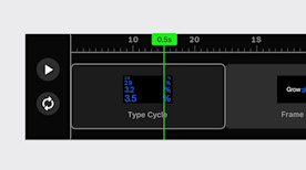
The beauty of Otto is that it’s preset with all our stylistic design elements — our font family, product UI, core color palette, prepopulated photography, and clear guardrails around copywriting within the tool. As soon as they hop in, anyone using Otto will automatically be creating on-brand motion assets that represent Square consistently. Key design features like international language support and sequencing multiple motion assets help people create longer narrative stories in markets around the world. Even internally, Otto helps level up the quality and visual experience when presenting concepts and putting ideas into motion.
The name game
Creating Otto is an example of writing the book first, then designing the book cover last. As we considered ideas about what to call the tool, simplicity and joy were our target attributes. Ultimately, Otto was a name that felt right for a few reasons. First, it’s a palindrome, spelled the same backwards and forwards. Second, it has a double meaning, speaking to the tool’s automatic nature. Lastly, the geometry of the letterforms would make for an elegant wordmark.

Forward motion
Since its launch in early March 2022, we’ve seen many people experiment with Otto, sharing various creative solutions across many different use cases. Whether it lives on our social channels, living storyboards, or within internal presentations to key stakeholders, the value of Otto is clear.
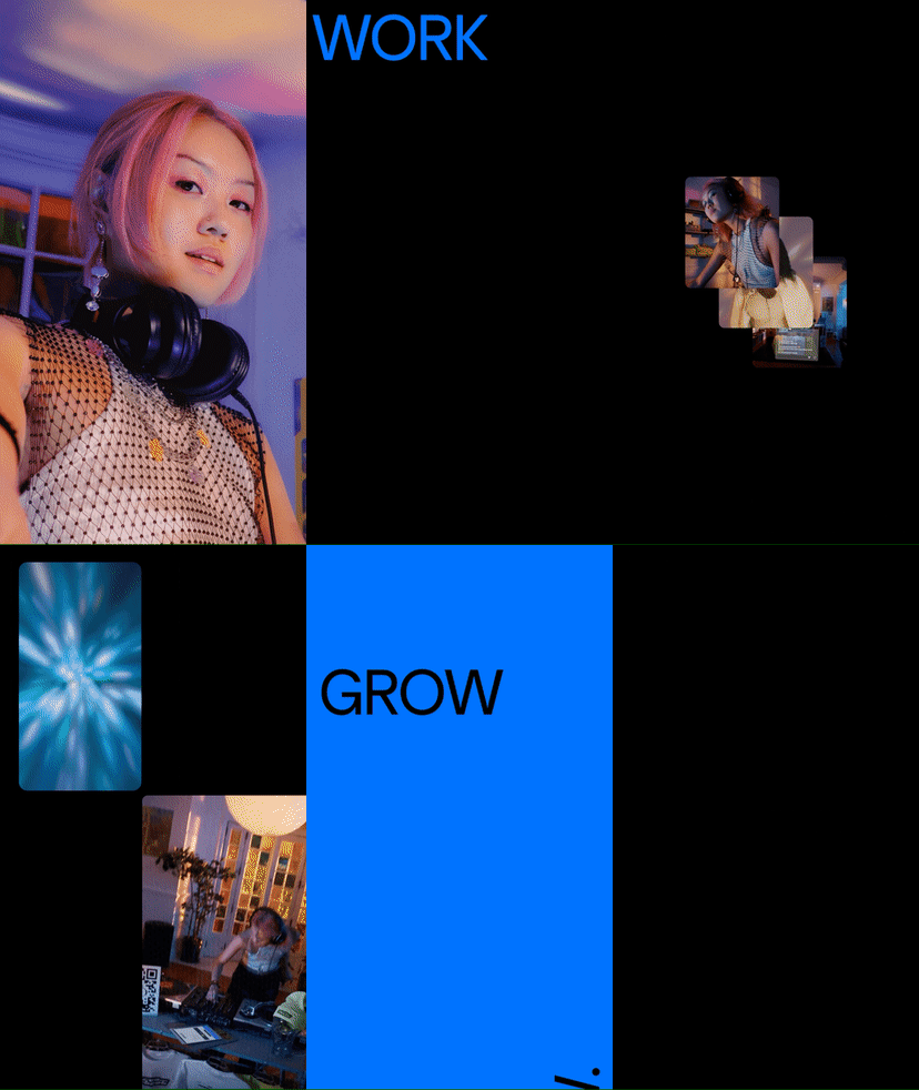


Overall, we wanted to empower everyone at Square to be their own creators. Our theory is that if everybody can easily and quickly design in motion, it will ensure consistency across Square’s global workforce. This tool is accessible, translatable, and flexible to people’s skills — not to mention it’s very intuitive to use and requires no training.
We worked with so many cross-functional partners inside Square to help bring Otto to life. The actual process involved weekly design and technology reviews and an open mindset between our teams, our partner Athletics, and our key stakeholders. It was invaluable to get as many divergent perspectives as possible, but inevitably we’d all have different needs and expectations. Seeing as it’s nearly impossible to get consensus on this level, open communication was key to this project’s success. The result: a precise, refined definition of what we wanted Otto to become.
In 2022 and beyond, the Brand Systems team will continue to mature Square’s brand with innovative resources and expressive, connected communications. We do this through constant collaboration and by developing systems and frameworks that never existed before. We’re optimistic about design and technology, and we’re always looking for ways to find unique solutions by asking ourselves, “What if?”
