When the Paycheck Protection Program (PPP) was first announced in response to the COVID crisis in April, lenders hurried to get a piece of the $349 billion of government funds to distribute to businesses in need. We watched as big banks tried to get a jump start on the application process by asking businesses to complete what was essentially a contact form and a complicated spreadsheet file upload. These large banks were also the most incentivized to lend to larger businesses — which, unfortunately, resulted in small businesses getting left behind.
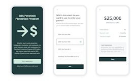
So instead of following their lead, we decided to invest more time up front crafting a quality experience, while focusing on providing access to as many small businesses as possible.
At the most basic level, we needed to:
- Collect some information about the business.
- Create a loan amount based on payroll costs.
- Verify the loan information and send to the SBA for verification.
- Send the loan to the seller’s bank account.
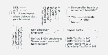
In reality, it was much more complex than that: Guidance from the SBA was constantly in flux, and there were varying requirements and documentation for different types of businesses. We were collaborating with a hardworking legal team to sort through the noise, and realized just how difficult it would be for most sellers to navigate the application process on their own.
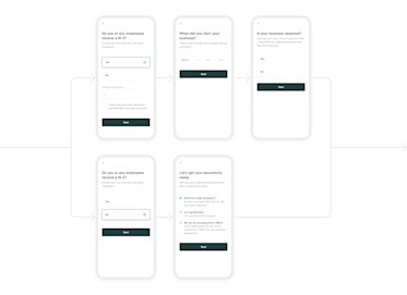
To make the process clearer, we reimagined the SBA application and used conditional logic to hide and show questions based on what was entered. This allowed sellers to focus only on what was relevant to their business. For example, if a business didn’t have employees, instead of asking for payroll costs, we knew we only had to ask about owner compensation.
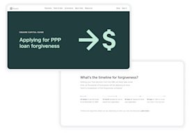
This was — and still is — an incredibly stressful time for sellers, with many unsure whether or not they’d even be able to keep their businesses afloat. Some had already applied through other lenders but hadn’t received any communication about their status or what to expect, causing even more frustration. To tackle some of these concerns, design and content strategy teams worked closely to ensure we were transparent with the application process through all our touch points, which included a suite of emails and a landing page.
The entire project was a huge, cross-functional, team effort with close partnership between product, brand design, content strategy, user research, product marketing, and engineering. We knew we were taking a (calculated) risk by spending extra time on design, so we counterbalanced by making decisions in phases and building in parallel. PPP funds were first come, first served, so our team worked around the clock.
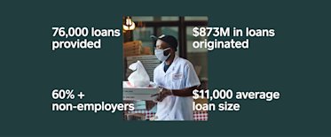
In the end, our investment paid off and we were able to provide access to over 80,000 loans with over $873 million originated. Over 60% of our loan recipients were non-employers. The average loan size was $11,000 — or 1/10th the size of the average PPP loan during this phase of PPP. This meant we were successful in serving a large population of small businesses who weren’t able to secure a loan through other lenders and were previously left behind by the PPP process.
The positive reactions from sellers let us know financial institutions — specifically banks — need to strive for higher levels of design innovation around user experience. We’re excited to continue this work as we build our new bank and continue to serve small businesses.
All loans are issued by Celtic Bank, a Utah-Chartered Industrial Bank, member FDIC


