Recently, our design team has set out to answer an important question: What is the secret sauce that creates a cohesive web design experience (factoring in over 16 teams across the company, with designers working on over 1,300 live pages)? As Square has grown rapidly over the past years and months, our design team has been facing the tried-and-true growing pains that are often cited when small, nimble startups are challenged to start “designing at scale.” The answer? A consistent and dedicated investment in design systems.
Specifically, my team is responsible for the design system of our global website, squareup.com. Our aim is to build a hardworking, flexible kit of components that any marketing designer can use when building landing pages or web experiences for their specific team. Simply put, this translates to a Figma library of components — everything from grid systems to hover states that designers can utilize. Hidden beneath the surface are countless hours of audits, design explorations, and, most importantly, collaboration.
In hopes of setting our Marketing Web design system up for success, I sat down with Josef Khoo and Bradley Ryan, teammates of mine who are currently focused on Square’s Market product design system.
Microphones and video on, blank Google Doc ready for notes, I asked to record the conversation so that I could share the wealth of information with you all. As the primary owners of Square’s UI design system, Josef and Bradley are responsible for so much more than the Figma library of components and patterns that serve as the foundational building blocks of our software. Their biggest challenge is to successfully scale the design system to hundreds of designers and thousands of stakeholders at Square.
“Our tooling has to be fantastic. We have to make it so good that other teams really want to use it.”
— Josef Khoo, Product Designer
I’d describe Josef and Bradley’s approach to scaling Market effectively as a grassroots effort — connecting directly with people. They walked me through the four focus areas they use to break down the complexity of their work: collaboration, decision-making, experience, and team.
Collaboration
What these two are clear on is the value of relationship building in their work. Josef and Bradley provide a variety of opportunities for designers to ask questions, collaborate on component designs, and feel confident using Market. They made over twenty Slack channels to create safe and focused spaces for teams to collaborate directly with them. While that many Slack channels may cause anxiety for other designers, Josef and Bradley see them as bridges to the people who build tools for businesses.
Systems at scale are about people — not just pixels.
Bradley Ryan, Product Designer
Larger organization channels are great for announcements and introductions to the Market design system.
In addition to Slack, Josef and Bradley hold a variety of meetings to facilitate open and honest discussions. Once a month they have a “Market Onboarding” session where they walk through the basics of Market and create awareness of the resources available. When Slack does not suffice, partnering teams have the opportunity to dig deeper into topics during weekly Market Design office hours. What I enjoy about office hours is the transparency around this collaboration method. Similar to a live stream, anyone at Square is welcome to join the conversation. There are no precious whiteboarding sessions behind closed doors.
Decision-Making
The details of a design system can get pretty granular and even subjective. Following a decision-making framework helps Josef and Bradley scale effectively and with minimal biases.
1. Frame the decision
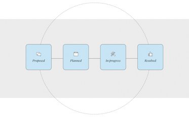
After hosting office hours, Josef and Bradley follow up, via Slack, with questions and a summary of where they landed on a decision. The benefits to this approach are creating transparent decision making, setting expectations and accountability, and providing a documented reference to the conversation. They are also fully aware of the complexity in a product team’s work, knowing they may not land on a decision in 30 minutes. And that’s okay.
“We likely can’t solve everything in the next few minutes, but let’s be clear on the problems we’re trying to solve.”
— Bradley Ryan, Product Designer
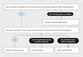
Designers are guided through a simple decision tree when they propose an improvement to the design system.
2. Use a clear framework
This was my biggest takeaway from conversations with Josef and Bradley. Mostly because this is what my team has been lacking. Rather than having one person or team share their opinions, relying on a framework creates an unbiased conclusion. And even better, fewer meetings!
3. Consider a range of perspectives
That holds true for both the design teams using Market and, most importantly, the sellers experiencing Square’s product. Internally that can be in the form of Slack discussions or polls. With sellers, that means using ongoing seller interviews to continually improve the system.
4. Take action
And boy, do they ever! I am always so impressed with the promptness of their Slack responses. Their empathetic approach to designers’ questions keeps the conversation open and honest. That, combined with their motivation to ship quality components, exudes confidence that is contagious.
With the right people and the right process, we’re confident in making a decision.
Josef Khoo, Product Designer
5. Document and communicate
Josef and Bradley’s method of documentation is thoughtful and has users — both designers and engineers — in mind the whole time. Josef is mindful of designers not all having the same workflow. The Market components are meant to be easy, intuitive, and flexible enough to accommodate the majority of workflows. They also provide sample screens, i.e. Market Gallery, to show designers tangible examples of how to use the components.
“With documentation, we focus on impact. What will help designers out the most?”
— Bradley Ryan, Product Designer
When a component is ready for use, the crucial step in measuring effectiveness is its use. You can have the most beautiful buttons, checkmarks, etc., but if there is no adoption, the design system is unsuccessful. Josef and Bradley have the awareness to continually reevaluate their documentation by asking themselves “does this make my designs easier and faster or does it slow me down?”
We have just skimmed the surface of what makes a design system. Keep an eye out for Designing at Scale: Part Two, where I’ll continue to unpack the focus areas of Experience and Team.


