Square Communities are employee-founded, self-organized resource groups that help advance belonging and inclusion for Squares of all backgrounds and identities. As part of supporting Communities, designers work on internal- and external-facing projects to help Communities shape their visual identity and share their members’ stories.
“Design within Communities is so unique as it incorporates the creative ways each Community shares their story at Square,” said Soleil Acree, an Inclusion & Diversity Specialist at Square.
It’s really powerful to see the way design weaves together specific colors, images, patterns, and cultural aspects in highlighting the identity of each Community.
— SOLEIL ACREE, I&D SPECIALIST
As part of this collaboration, Design creates small campaigns or projects for Community “Spotlight Months.” Spotlight Months are special designated times when Communities get additional resourcing to highlight themes and messages important to them. Sometimes Spotlight Months align with nationally recognized months, such as Asian Pacific Islanders (API) Month in May and Pride Month in June. More often, Communities are randomly assigned a month, such as the parents’ spotlight in July.
Square has over a dozen Communities now, but I’ll focus on these three corresponding Square Communities — API Squares, Squeers, and Parents@ — which all recently undertook design-led projects to share their stories and connect their members to each other and with the wider community. I spoke with the designers behind each project to learn more about their inspiration.
A bandana designed for Pride
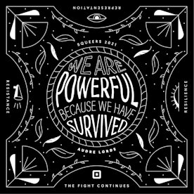
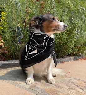
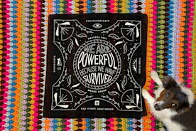
Chloe Stokes, former Chair and current member of Squeers, created a bandana for Squeers in honor of Pride Month. “It’s really hard to convey complex community identity and ideals on a bandana,” she said. But that’s what she did. Even with the limited space, Stokes homed in on a vision inspired by this year’s theme, “The Fight Continues: Representation, Resistance, Resilience.”
That concept of resilience, in particular, informed the bandana’s final design. “Leaning into nature allows you to convey growth, beauty, and light but also the circle of life. It felt like a nice reference to the past, present, and future of the queer community.” That natural motif is also airy, leaving space for the powerful Audre Lorde quote that Stokes chose to speak to the theme in big, bold type.
The bandana design also served as a frame for Community artwork on the Square Creatives Instagram feed. The artwork, along with poetry, was sourced directly from the Squeers community to create a zine, i.e., a collective publication of self-expression.
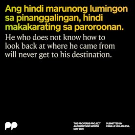
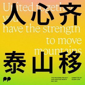
Proverbs to connect the API community
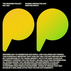
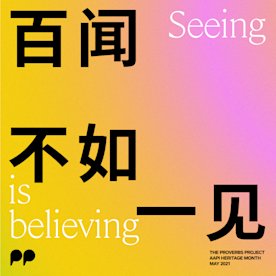
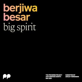
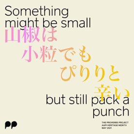
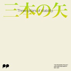
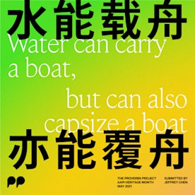
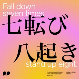
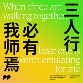
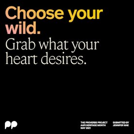
For API heritage month, Finn Wang, Eileen Tjan, and Mio Yoshigiwa created the New/Old Proverbs project. They collected favorite proverbs from community members and designed each to live as a post on the Square Creatives Instagram feed.
The typographic collaging, intermingling of Latin characters, and the variety of native languages submitted plays on the dual identity many Asian Americans experience while balancing two cultures.
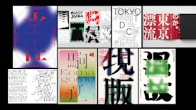
The designers intentionally produced varied work to empower each individual voice, story, and significance. You can tell you’re looking at a series, but each post’s design speaks for itself.
We were really excited about the idea of proverbs being ‘words of wisdom’ and how they have been passed on for centuries verbally.
— MIO YOSHIGIWA, API SQUARES MEMBER
“We started playing around and visualizing how voice traveling and influencing would look in colors or patterns,” explained Mio Yoshigiwa, an API Squares member. “From this exploration, we designed one large gradient background and decided to use parts of that in each post. Each post has its unique background, but when you look at it in its entirety, you can see the whole picture as one.” The project included a total of twelve stunning posts.
A cookbook for parenting in unprecedented times
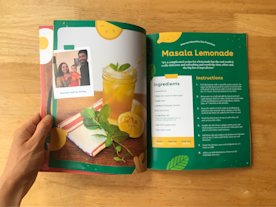
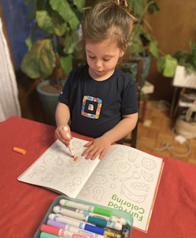
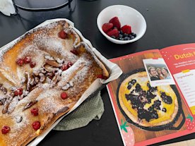
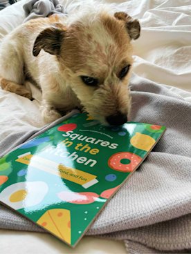
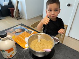
The pandemic introduced near-impossible parenting challenges: sudden homeschooling, kids crashing Google Hangouts — though to be honest, I loved every guest appearance — and maintaining some semblance of a balanced lifestyle. It’s no surprise that folks were craving easy and accessible family recipes they could whip up after a long day. That’s where Angie Garland, a designer on the Corporate Purpose Communications team, stepped in to help members of Parents@ create something tangible, helpful, and well-designed: a cookbook.
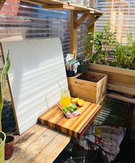
Garland worked closely with the community to collect and review recipes, gather family food stories, and remotely art-direct kitchen photoshoots. One parent even set up a makeshift photo studio in their greenhouse, which was really next level.
“We wanted to keep the tone light and optimistic, so I used a bright and playful color palette, paired with a simple and emotive illustration style to complement the beautiful food and family photography,” Garland said. Members of the Parents@ community made suggestions about the book’s materials to ensure durability: “Knowing the book would be used in kitchens with young families, we opted for a semi-gloss paper stock to ensure spills and smudges were easier to wipe off.” Parents think of everything.
Design gives voice to individual and collective experiences, strengthening bonds within communities and building bridges between them — whether it’s through a bandana you wear, an Instagram post you share, or a cookbook you consult for tonight’s dinner with your family.
