In April 2020, at the beginning of the coronavirus pandemic, Square received conditional approval from the FDIC to operate our own bank, Square Financial Services. This was a huge and exciting opportunity for us, the now Square Banking team. Our first task? Design a deposit product specifically for small businesses — this would become Square Savings.
Small business owners are as unique, creative, and diverse as the businesses they run. What would make a savings product perfectly suited to them? We turned to our research team for answers.
Red Bay Coffee Roasters, HQ and Cafe, Oakland
We discovered many business owners had never opened a business savings account before — they were running their businesses from their personal checking accounts and didn’t separate their expenses. Most wanted to save but felt unsure where to start. Some had specific goals in mind, but moving money back and forth between accounts was too time consuming. They didn’t have the right tools to manage their finances in a way that worked for them.
One struggle they all shared, though: Setting aside money for taxes.

Now it was time to get to work.
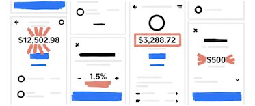
We visualized a savings product that could do it all for our sellers: help them save for taxes and future goals, let them separate and organize their money, and even automate moving money to and from accounts. Creating a best-in-class user experience guided our every design and creative decision.
Our guiding principles
Simplicity. Traditional banking products can be complex and clunky — we focused only on the essentials to keep ours simple.
Good products don’t overwhelm the end user. Throughout the Square Savings experience, we guide the seller’s attention to one thing at a time (and make sure it’s the right thing). Whether it’s having conditional logic for onboarding, creating layout hierarchy with strong size contrast, or simply using step-by-step flows for setting up features, there’s a clear purpose behind each step.
Expression. Banking products don’t have to be boring. We express ourselves through bold layouts with strong contrast and clear hierarchy. And it looks good, too.
Intent. In every user journey, there’s intent behind every action. Our sellers should feel like their needs were anticipated, and that we listened to and understood them. We designed every flow so the journey feels natural and expected.
Voice and tone. Because Square Savings is the first business savings account some sellers have ever opened, we were thoughtful about voice and tone, too. Our in-product copy speaks to business owners in an informative yet warm and human voice — not the cold and sterile tone of so many typical banking products.
We also believe in cohesive product and marketing experiences (product = brand / brand = product). We maintained a consistent narrative from the marketing landing page to the product flow because, to our sellers, it’s all one experience. Check out how we developed the marketing creative ›
Features small business owners actually want
To help sellers separate and organize their money, we introduced savings folders. Folders are customizable, so sellers can save for taxes, rainy day funds, or a new espresso machine — whatever they may need for their business. And they can automatically set aside a percentage of their daily Square sales to any folder, so saving becomes easier than ever.
We also provide a competitive annual percentage yield (APY), so business owners can earn interest on their savings and reach their goals faster.
The response
Feedback from Square sellers has been overwhelmingly positive. But launching Square Savings (and Square Banking) is just the beginning. We’re excited to continue to build a new bank that serves small business owners.
Savings accounts are provided by Square Financial Services, Inc. Member FDIC.


