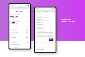
A little over a year ago, the checkout experience for Square Online was a bit of a mess. Without pausing to review the entire holistic experience, we’d been steadily adding on features and functionality, resulting in an overstuffed muddle, both from an experience and code perspective. An overhaul was long overdue.
We wanted to dream up a best-in-class, truly remarkable checkout experience that was in line with our longer-term vision of Square Online checkout as a flexible, scalable platform.
We kicked off the initiative with a cross-functional design sprint, involving designers, engineers and product managers. The goal was to determine the principles that would inform our vision for the online purchase experience, as well as the requirements for a successful experience. We didn’t want to take any part of the experience for granted, questioning even the things we thought of as fundamental.
We didn’t want to take any part of the experience for granted, questioning even the things we thought of as fundamental.
After reviewing various checkout experiences (i.e., placing a lot of online orders for boba and greeting cards), sketching out crazy ideas, discussing what was technically feasible now and what might be feasible later, we outlined the following principles:
**Prioritize mobile.** About 80% of transactions on Square Online come from mobile devices, so perfecting the experience on mobile would make or break the experience for the majority of buyers.
Reduce friction. Reduce steps, reduce taps, reduce typing – smooth the whole process for the buyer so purchasing could happen quickly and seamlessly.
Make it scalable and responsive. Our approach needed to be responsive to a variety of sellers’ needs, across verticals and use cases, and to grow with Square Online as we continued to expand functionality.
Use mobile interaction patterns. Things like popping up a numeric keyboard versus an alphabetic one, depending on the form input, are those minor interactions that can truly set an experience apart.
With our principles defined, we were ready to have some fun with visual explorations. We leveraged existing component and pattern work from the Site Design team, but started from scratch on the overall flow and information hierarchy.
Fulfilment section variations
The final direction was visually restrained, responsive and modular, with different functional sections that could be hidden, rearranged or expanded depending on the needs of the seller and order. The biggest change was moving from a step flow to a single-page view. This substantially reduced the number of taps required – especially on mobile, where buyers could navigate form elements with native controls.
We especially needed to make sure that how we released our changes didn’t disrupt existing sellers and cause them any loss of sales.
At the same time that design was having a free-for-all in Figma, engineering was structuring their approach to building a brand-new checkout platform. The backend approach would have a major impact on how they could rewrite the front end. Design stayed very close to these discussions, ensuring we were keeping the user experience in mind. We especially needed to make sure that how we released our changes didn’t disrupt existing sellers and cause them any loss of sales.
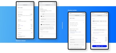
We decided to start with a re-skin of the current checkout experience with no changes in functionality, to ensure that when engineering started rewriting individual pieces of the checkout, we wouldn’t create a visual Frankenstein’s monster, and the changeover in the backend would be invisible to both sellers and buyers.
The re-skinned (left) and rewritten (right) checkout experiences
Once engineering and design were aligned on this approach, we worked with analytics on the pieces of the checkout funnel that we needed to track to keep an eye on conversions and the new experience’s overall performance.
Out of an abundance of caution, we launched the re-skin and, later, the rewrite, as successive A/B tests. Even though there was no reason to suspect our changes would obstruct buyers, any loss of sales for our sellers was unacceptable, so we wanted to err on the side of extreme caution.
Although the process began as something design-led, it would have been impossible without intense cross-functional collaboration and constant reference to the principles we defined at the outset. The importance of this experience was clear to everyone, and we all wanted to make sure we got it right for our sellers, their customers and the future of Square Online.


